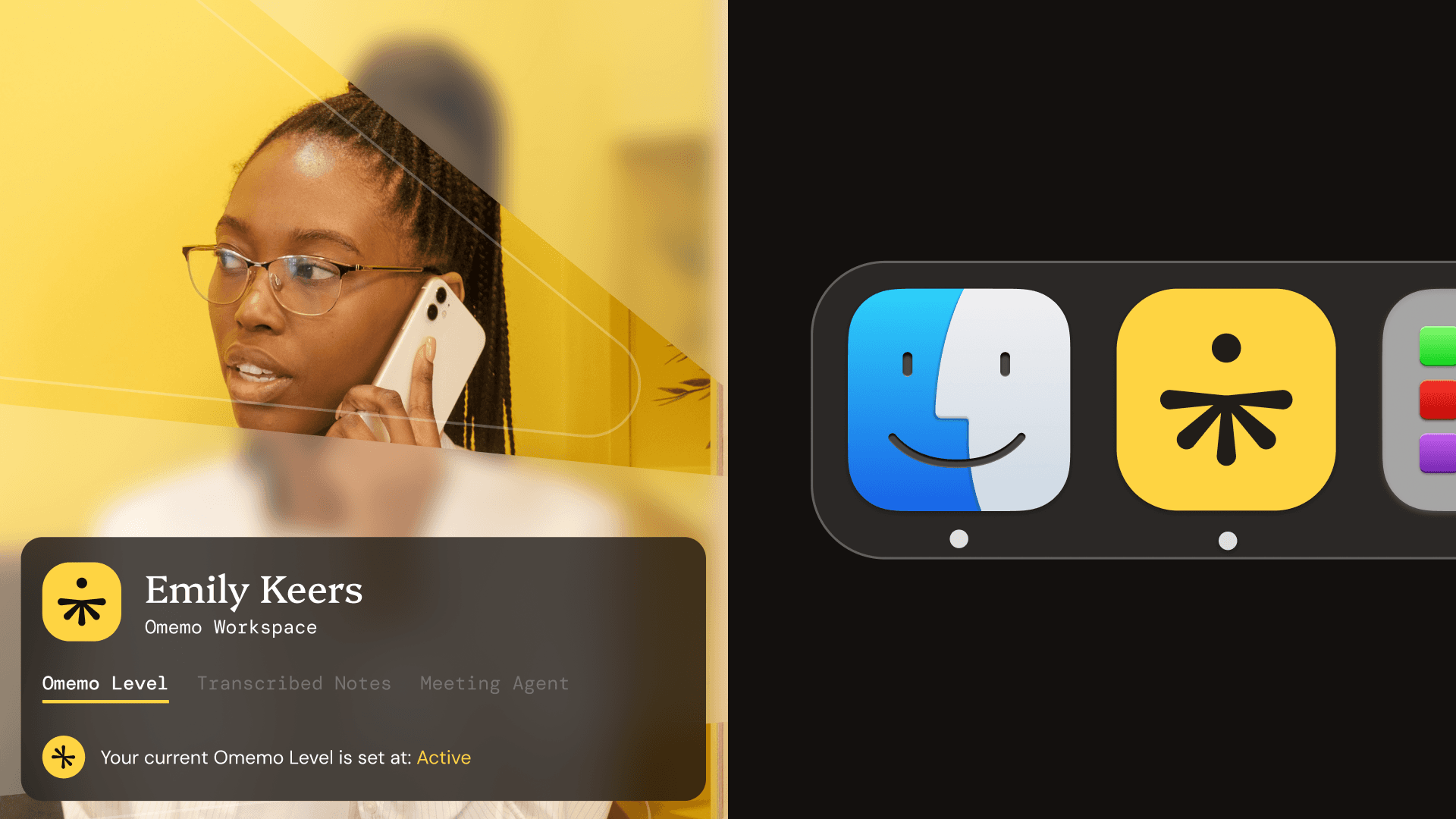
Omemo is an AI Meeting Agent with a twist, it is designed for those who are on the fence about using AI in their work. The Omemo app allows it's users to have full control over how AI influences their day to day workflow.

The challenge for this project was to create a visual identity that stood out from the usual AI Agent and note-taking brands in this space, whilst showcasing what is unique about Omemo and why new users should choose this brand over competitors.

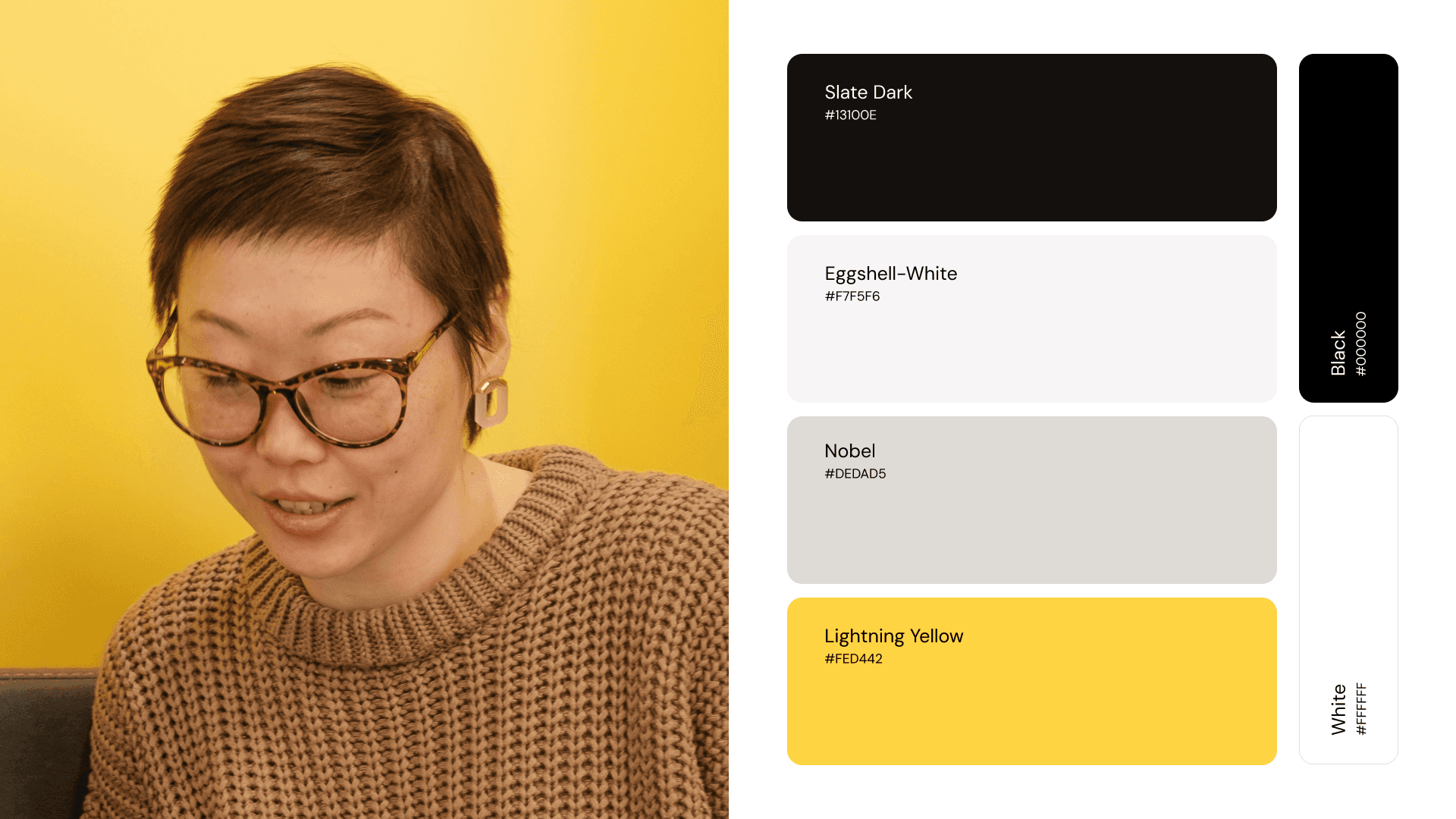
The majority of brands in the Tech / AI market gravitate towards using corporate colours such as blue, green or black and white. I realised that to differentiate Omemo, I would need to use a more out-of-the-box colour palette such as a mustard yellow and mud brown, the reason for this choice was to make the brand feel 'Dirtier' like the users were getting their own hands dirty with work instead of allowing AI to do it all for them.
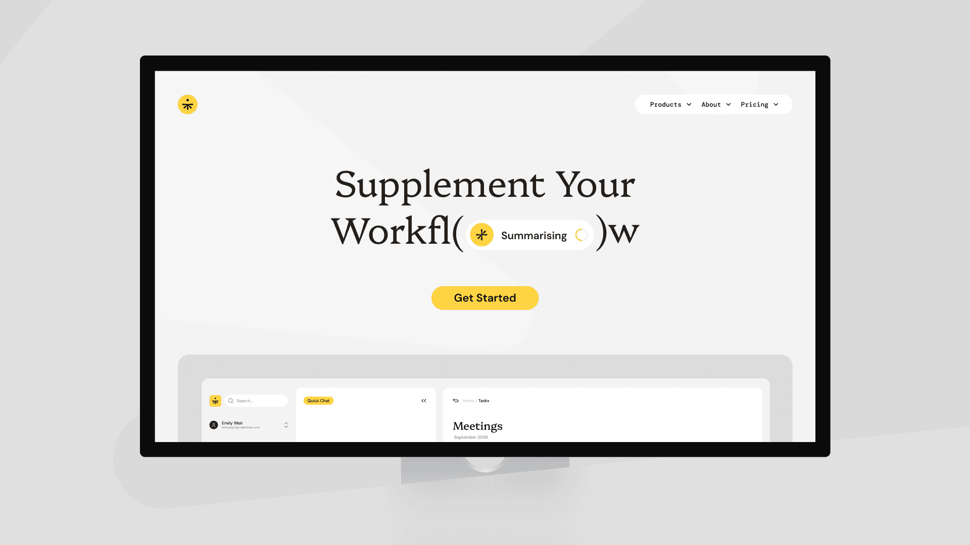
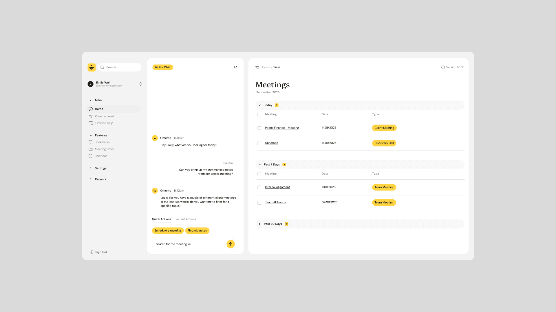
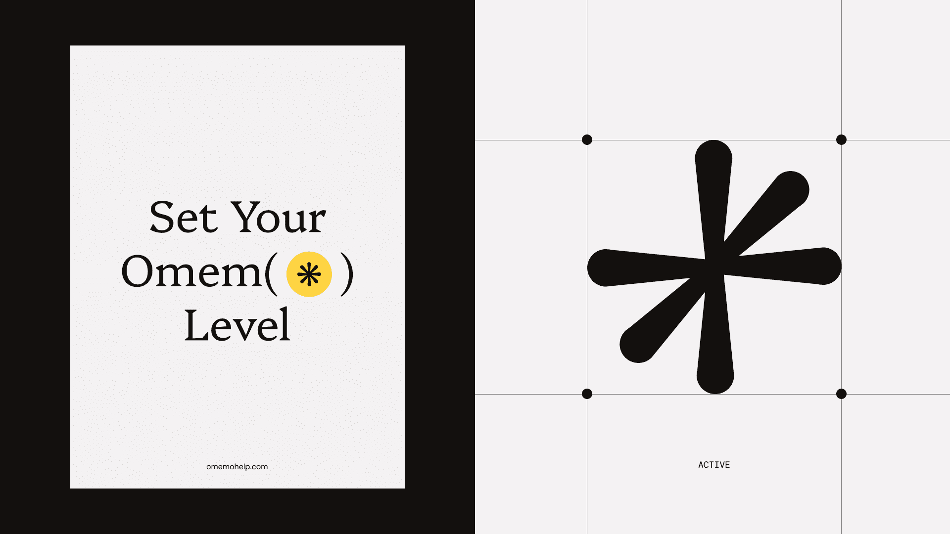
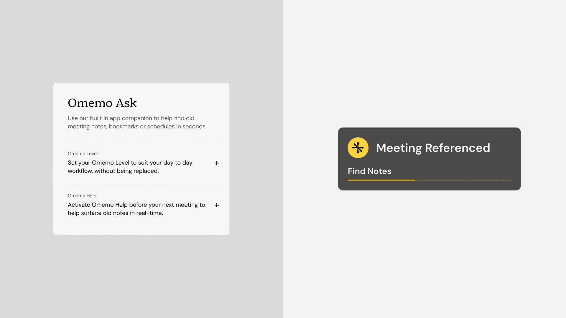
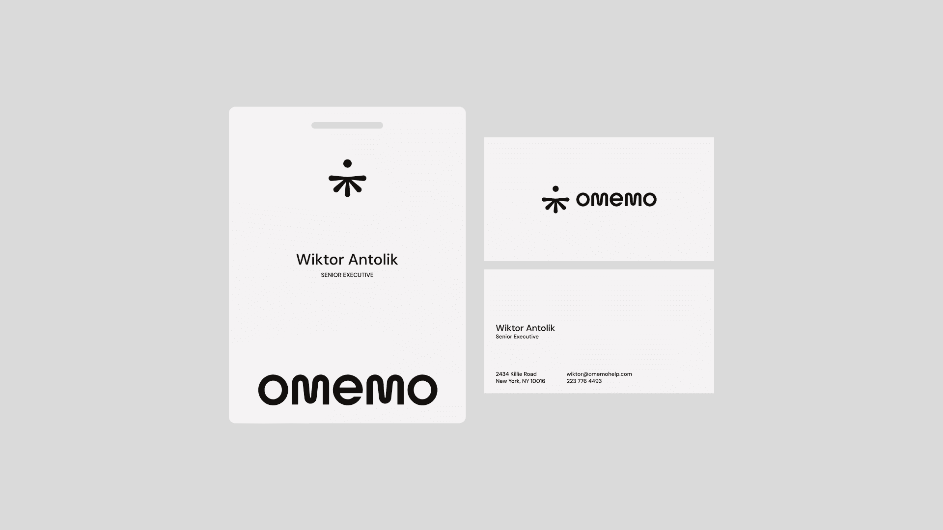
During this project I created a brand new logo mark and type mark design, custom iconography for the brand as well as a small library of UI screens and components to see what the brand would look like in the real world if it existed today.